/ Project Overview
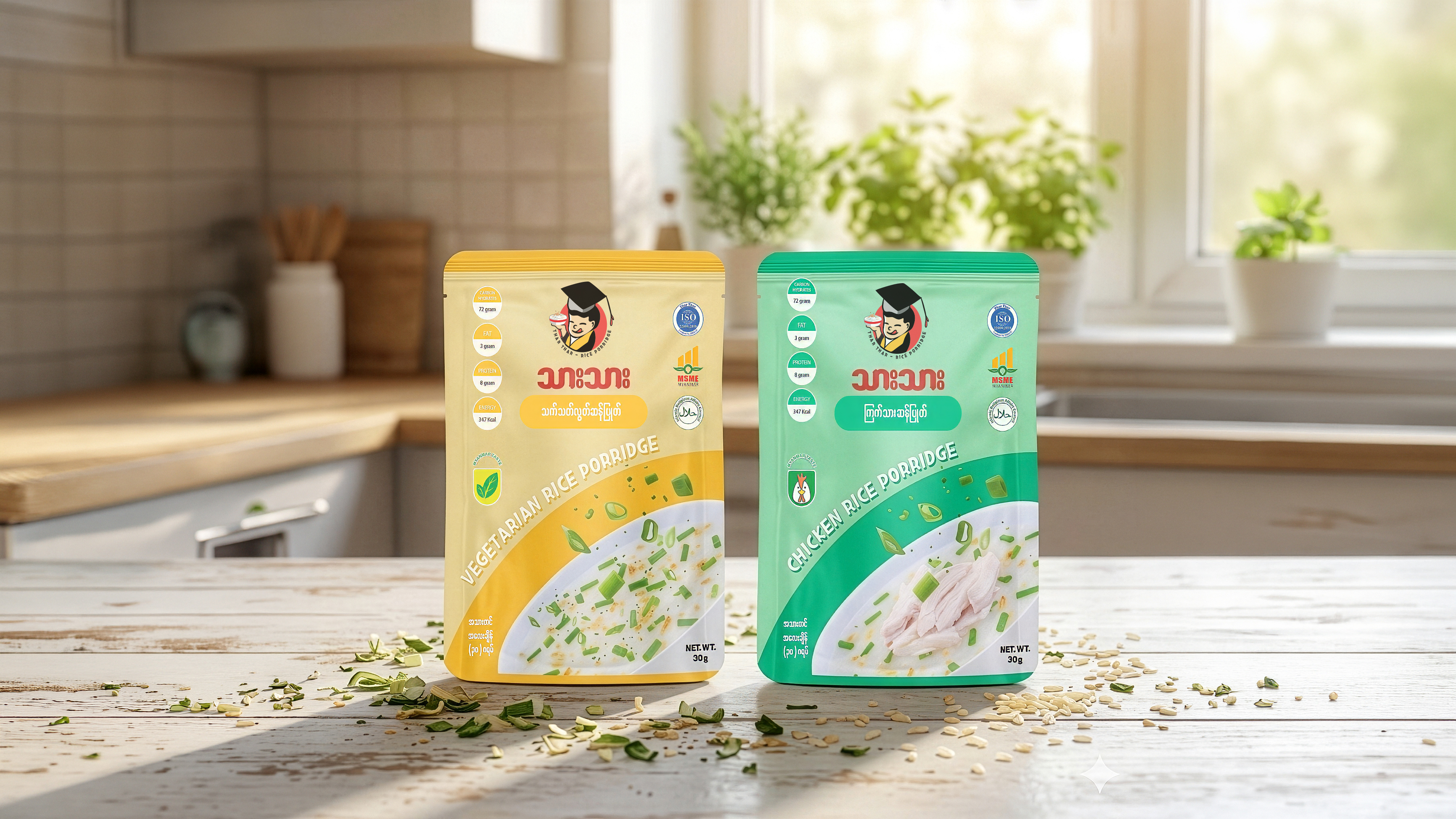
The design features a bright, appetizing aesthetic with a soft color-coding system—creamy yellow for Vegetarian and a fresh mint green for Chicken. A central character logo of a young “scholar” enjoying a bowl of porridge adds a touch of warmth and playfulness, suggesting that the meal is “brain food” or a smart choice for growth. Key nutritional data, like protein and energy counts, are presented in clear, vertical bubbles on the left, while the bottom half of the pouch displays a high-definition photograph of the porridge garnished with fresh spring onions, creating a direct visual link to the product’s flavor and texture.
/ Challenges
A significant challenge was integrating a large amount of certification logos—including ISO, MSME Myanmar, and Halal—without overwhelming the main brand identity. We had to ensure that these trust markers were clearly visible to build consumer confidence while maintaining enough white space to keep the design feeling light and “instant.” Additionally, balancing the dual-language text (Burmese and English) required a precise typographic hierarchy to ensure the product name remained the focal point regardless of the consumer’s primary language.
/ Objectives
The main goal was to create a packaging look that feels both “home-cooked” and scientifically formulated. By placing the “Nutrition Facts” front and center rather than hidden on the back, the objective was to appeal to the modern, health-aware shopper who wants transparency about carbohydrates and calories. We also aimed to establish a strong shelf presence through the use of bold, slanted typography for the product names, ensuring the pouches catch the eye even in a crowded instant-food aisle.