/ Project Overview
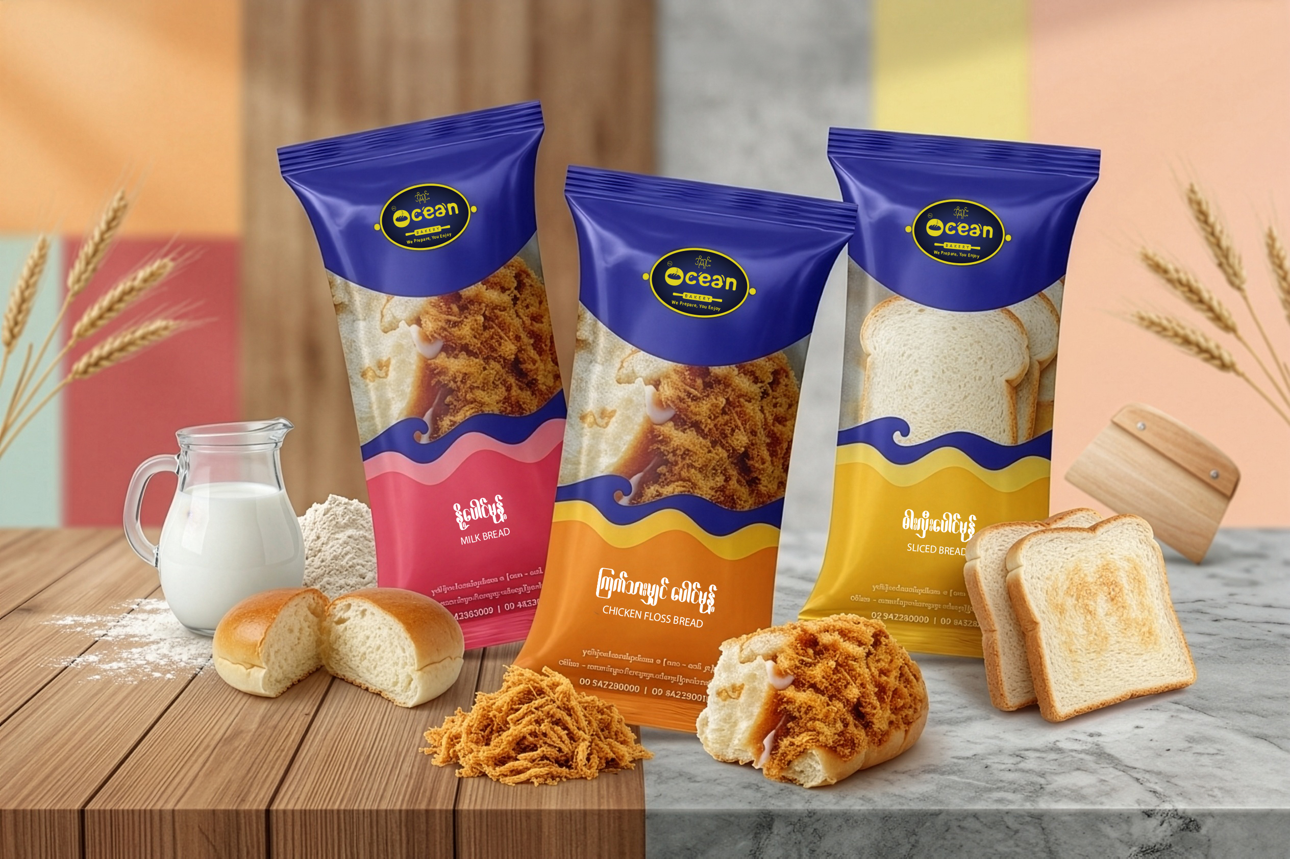
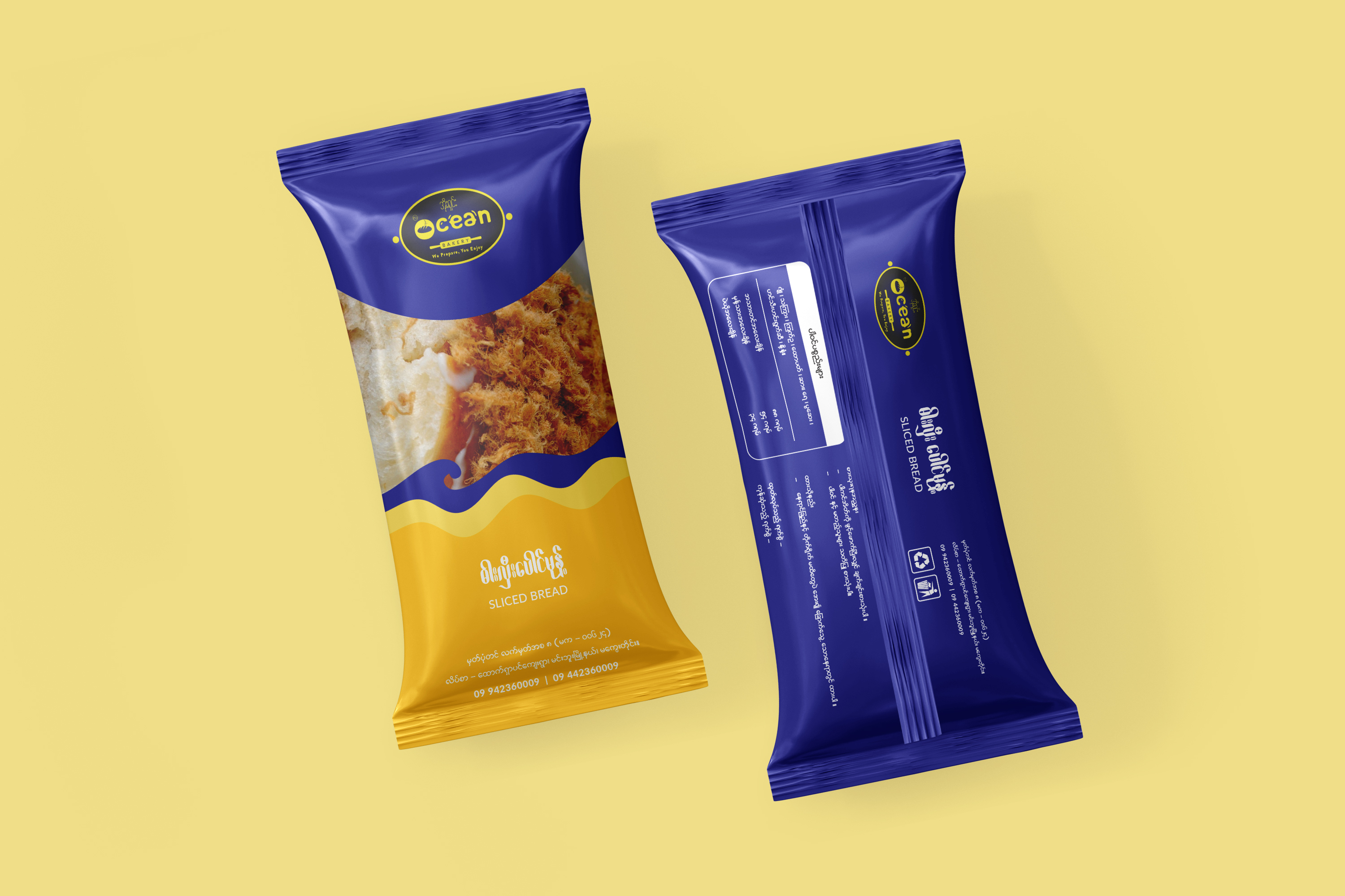
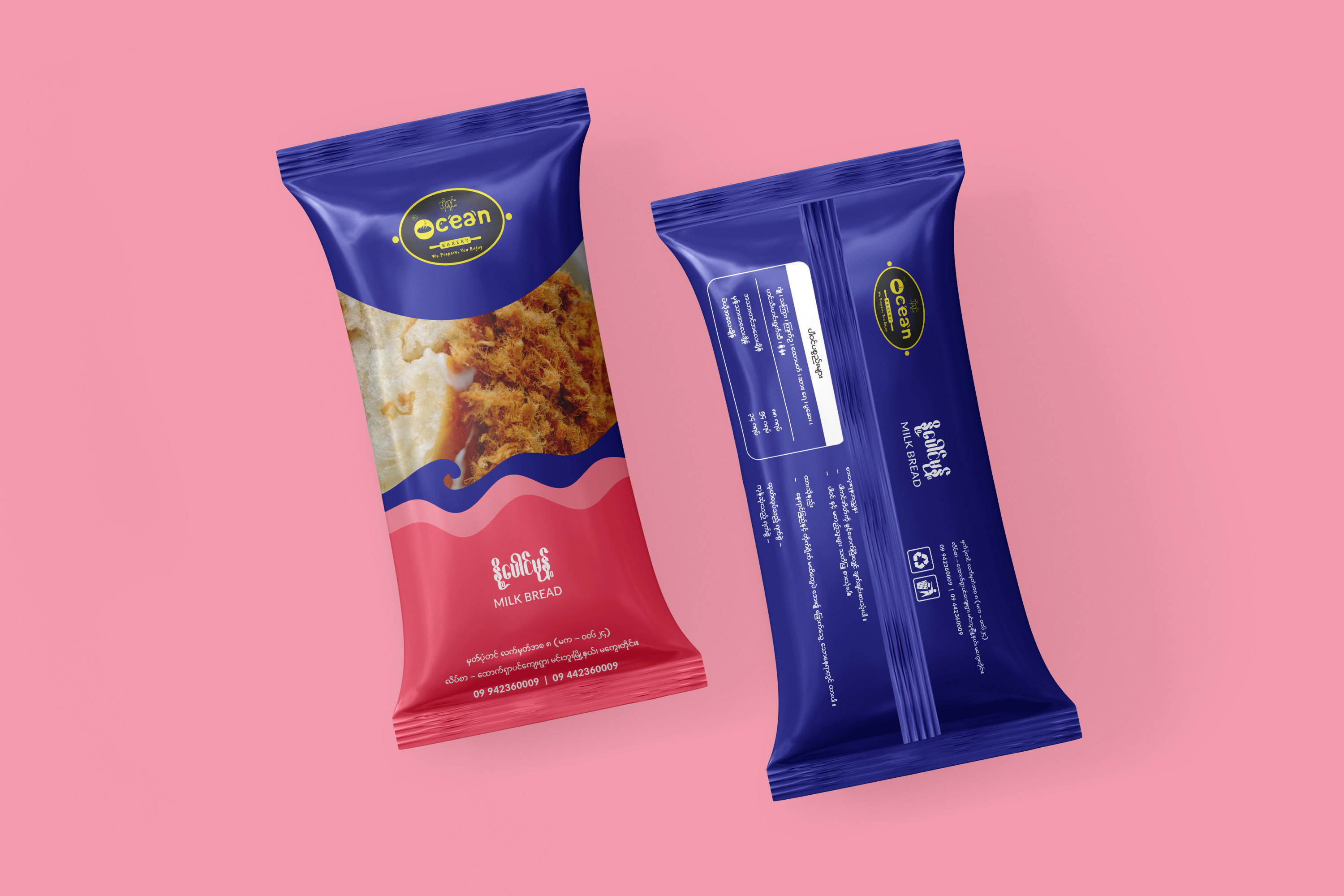
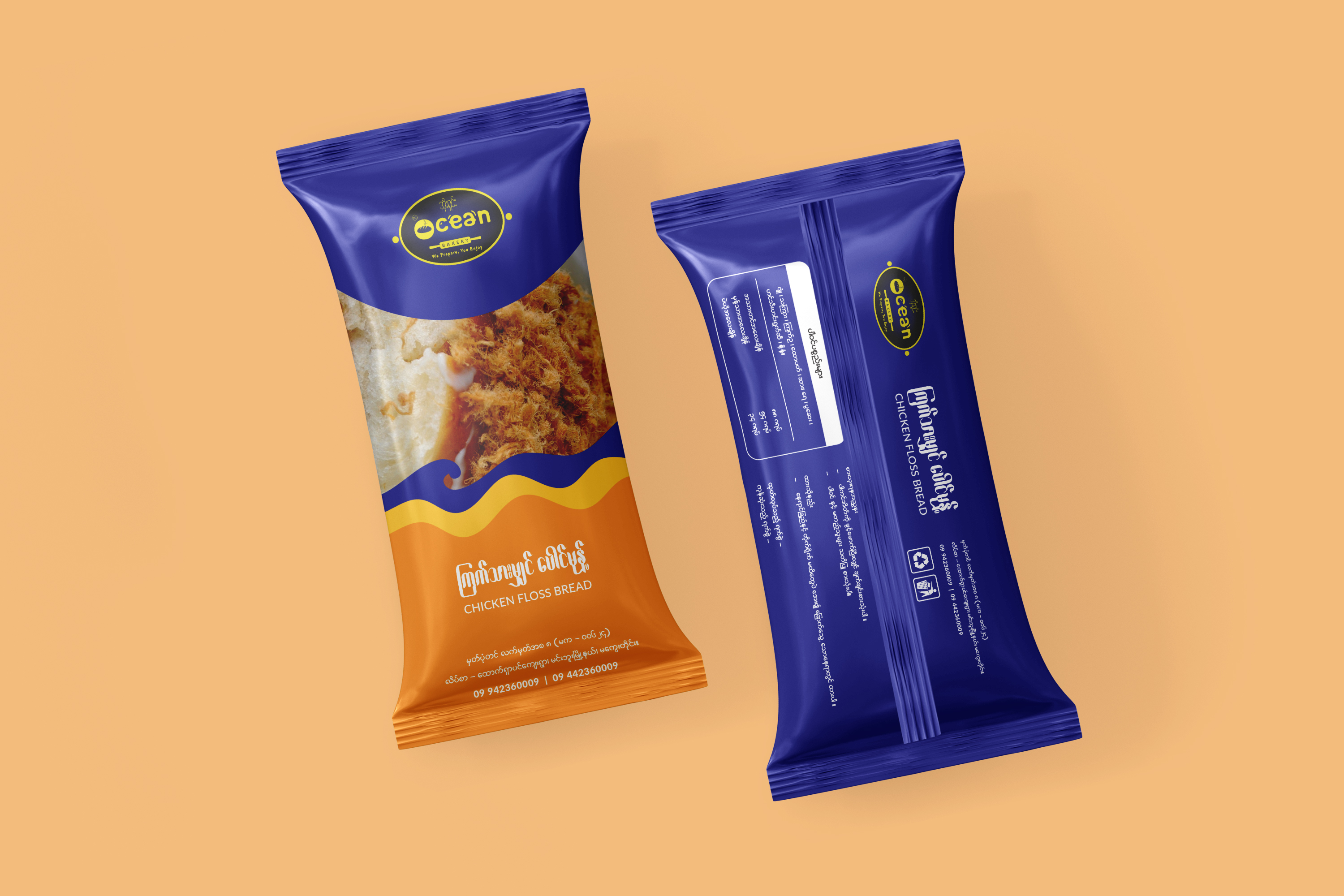
The packaging features a “flow-wrap” style pouch with a sophisticated matte finish. The top third of the pack is anchored by the Ocean Bakery logo on a deep navy field, while a dynamic, wavy die-cut border transitions into a vivid color block at the bottom. The central portion of the front panel features a high-resolution close-up of golden-brown bread, providing an immediate sensory cue. The back of the pack is streamlined and professional, featuring a clean white information panel for ingredients and a vertical arrangement for branding and recycling symbols.
/ Challenges
One of the main challenges was maintaining brand consistency across different product varieties while ensuring each flavor felt distinct. Because the central product image remains constant across the mockups, the design had to rely heavily on color psychology and typography to communicate the specific contents to the consumer. Additionally, organizing a significant amount of regulatory text, contact numbers, and ingredient lists on a slim, vertical pouch required a meticulous layout to prevent the packaging from looking cluttered or overwhelming.
/ Objectives
The primary objective was to establish a recognizable brand “uniform” that allows for easy shelf navigation while maintaining high appetite appeal. The design sought to balance functional information, such as nutritional data and contact details, with an evocative visual style that conveys freshness and quality. Specifically, the use of a signature wave-like graphic element serves to reinforce the “Ocean” brand name, creating a rhythmic and fluid visual language that stands out in a crowded marketplace.