/ Project Overview
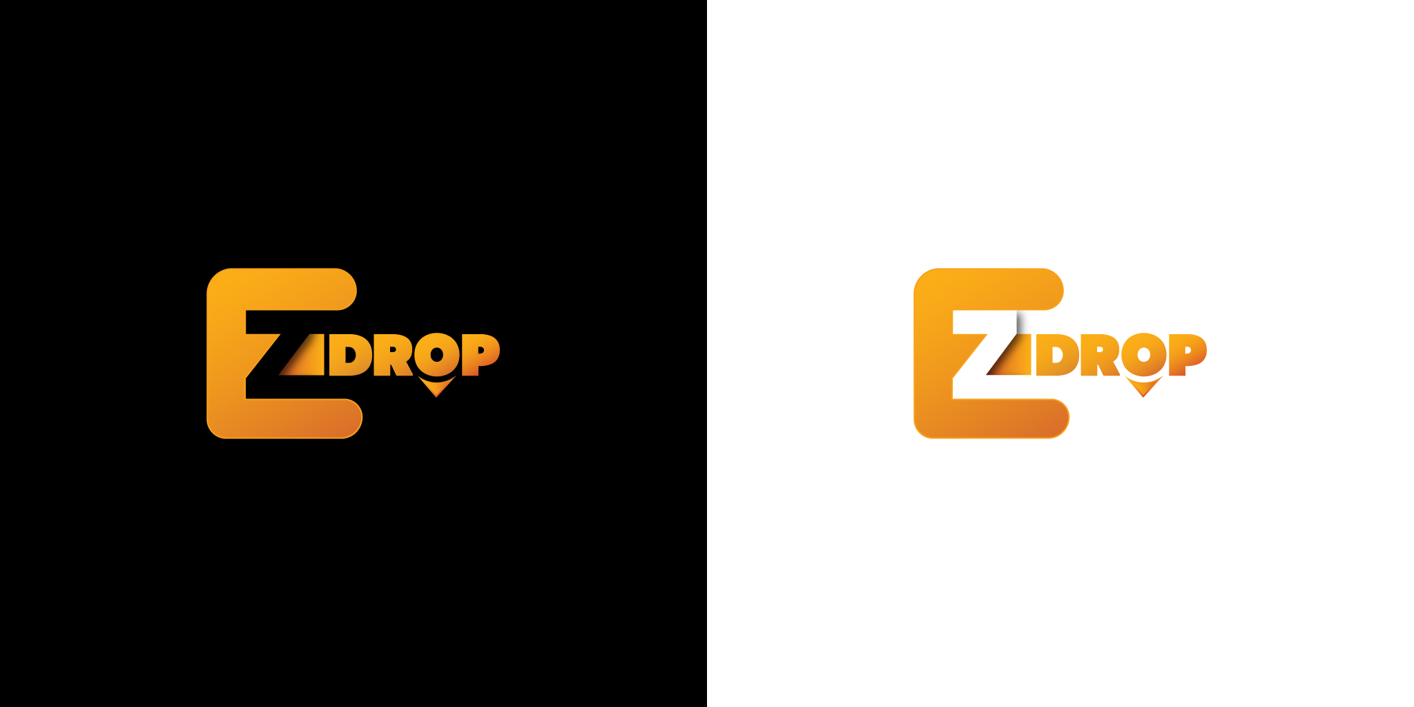
The logo features a custom wordmark where the “E” and “Z” are integrated into a single, cohesive unit, symbolizing the “easy” nature of the service. A vibrant orange-to-yellow gradient is applied to the lettering to evoke energy and movement, set against a deep black background for maximum contrast. The design incorporates a subtle location pin element beneath the letter “O,” grounding the brand in its core functionality of geolocation and package tracking.
/ Challenges
The primary challenge was ensuring the “EZ” ligature remained highly legible while maintaining a unique, stylized form. Balancing the negative space where the “Z” intersects with the “E” required precise geometric adjustments to prevent the mark from feeling cluttered. Additionally, the team had to find a way to incorporate a “drop” or “location” symbol without relying on overused logistics tropes, ensuring the brand stood out as a premium digital product rather than a traditional courier service.
/ Objectives
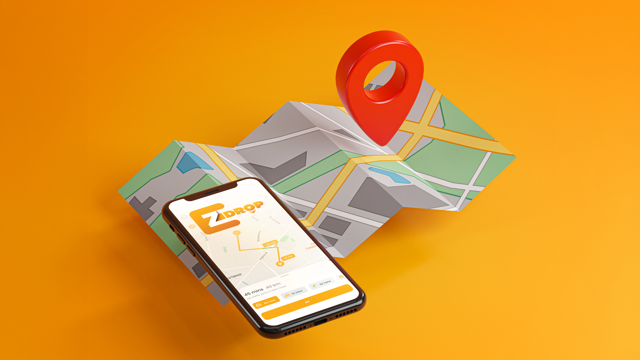
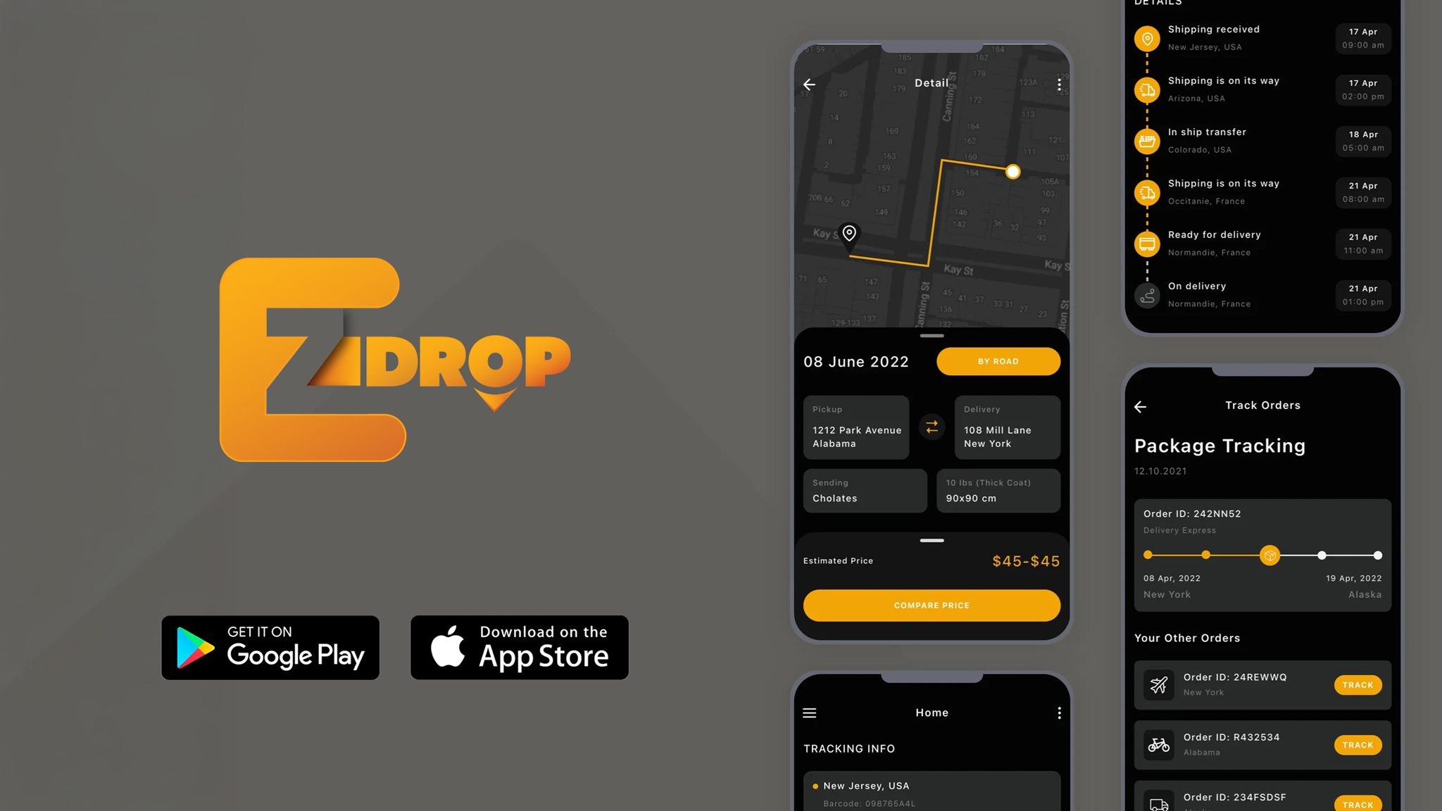
The main goal was to establish a visual language that feels both approachable and professional. The objective was to create a “sticky” brand mark that users could instantly recognize on a mobile interface or a physical parcel. By focusing on a minimalist but high-impact color palette, the design seeks to build trust through clarity, suggesting that the complexities of tracking are handled with seamless precision behind the scenes.