/ Project Overview
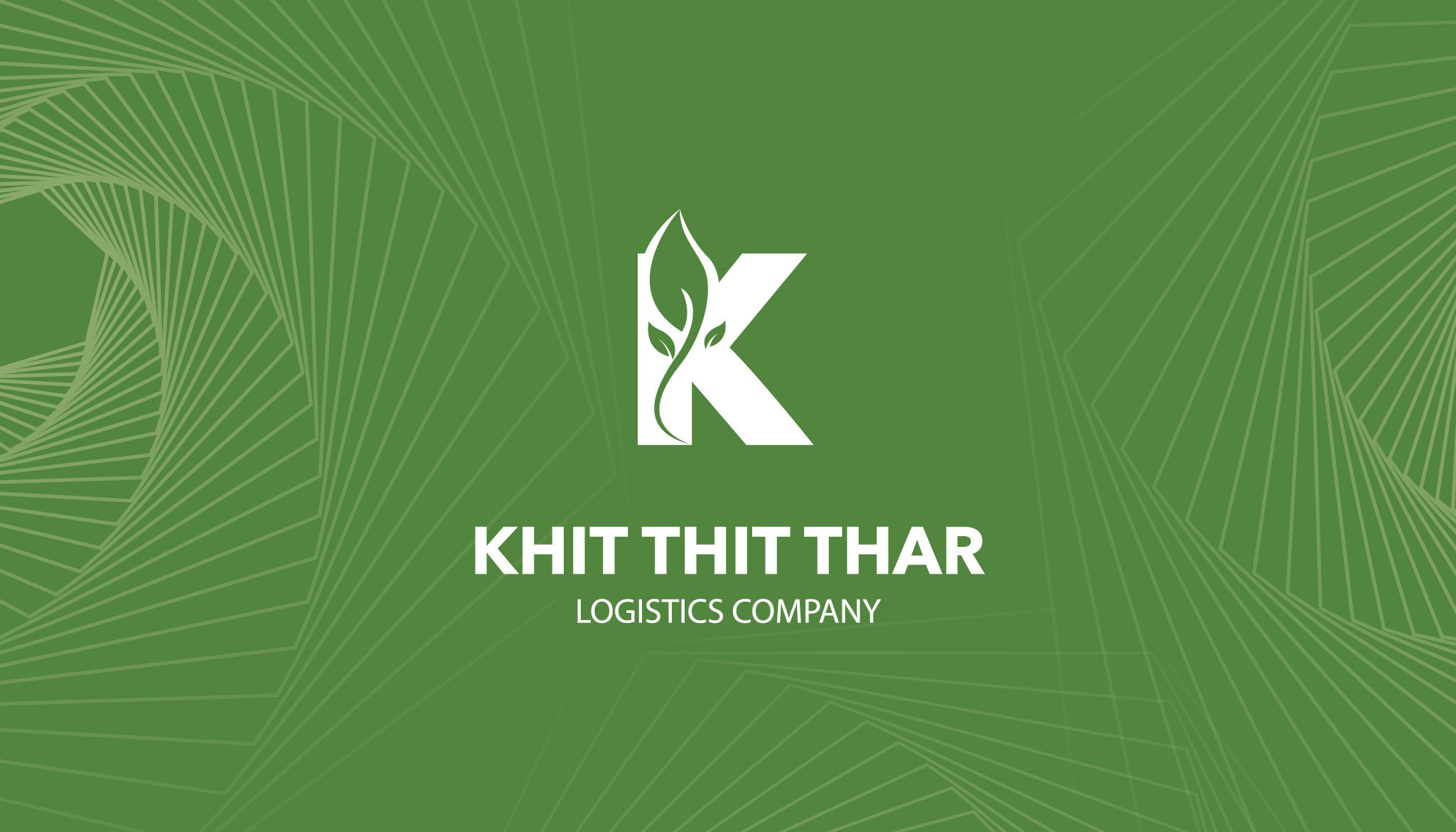
The primary goal of this logo design was to create a versatile and recognizable mark that communicates growth, reliability, and “green” logistics. The objective was to move away from traditional, heavy industrial imagery and instead highlight the company’s “Khit Thit” (New Era) philosophy through clean lines and natural elements. It was essential that the final brand mark felt both authoritative enough for the logistics industry and approachable enough to represent a sustainable, modern business model.
/ Challenges
One of the significant challenges in this design was the seamless integration of a delicate leaf sprout into the rigid, bold structure of the letter “K” without compromising legibility. Logistics branding typically relies on symbols of speed or heavy machinery, so pivoting to a nature-inspired theme required careful balancing to ensure the company still felt robust and capable. Additionally, creating a background pattern that felt dynamic and representative of “movement” while maintaining a minimalist aesthetic required precise geometric execution to avoid distracting from the central logo.
/ Objectives
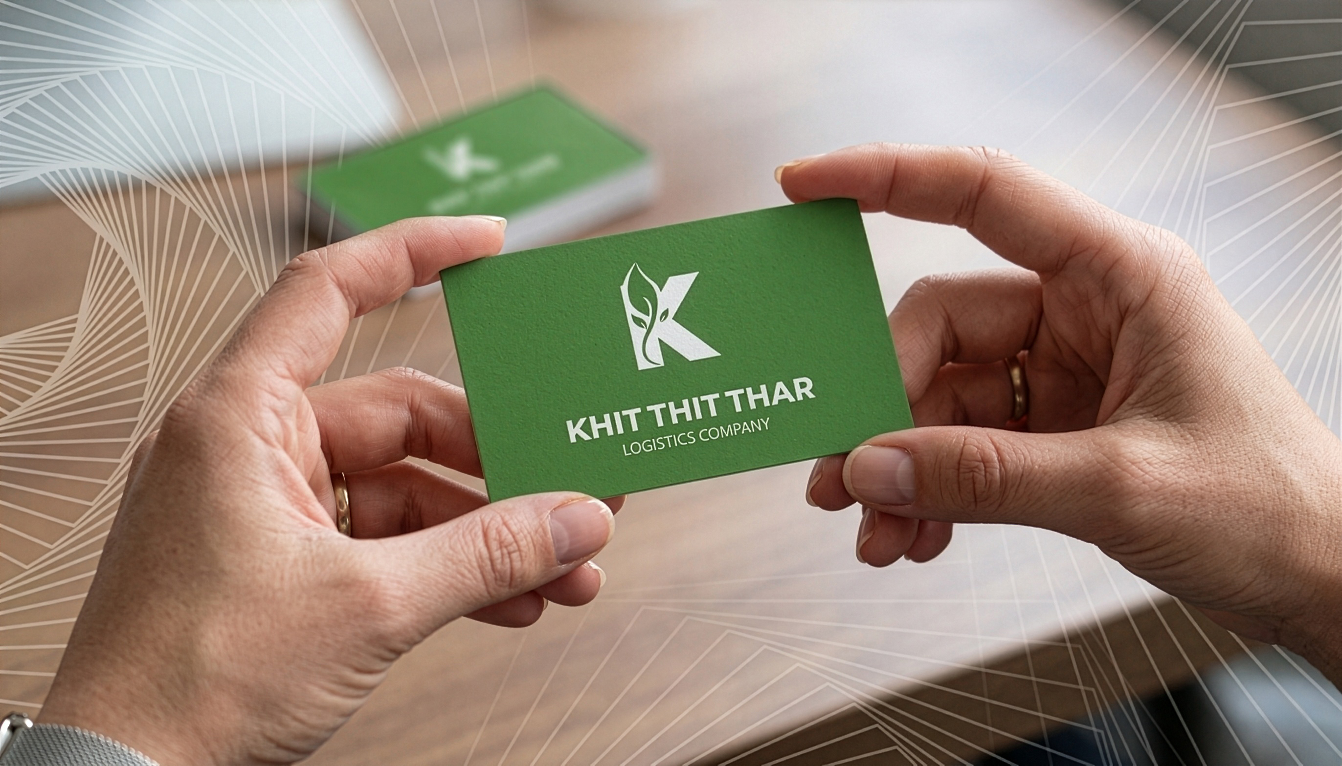
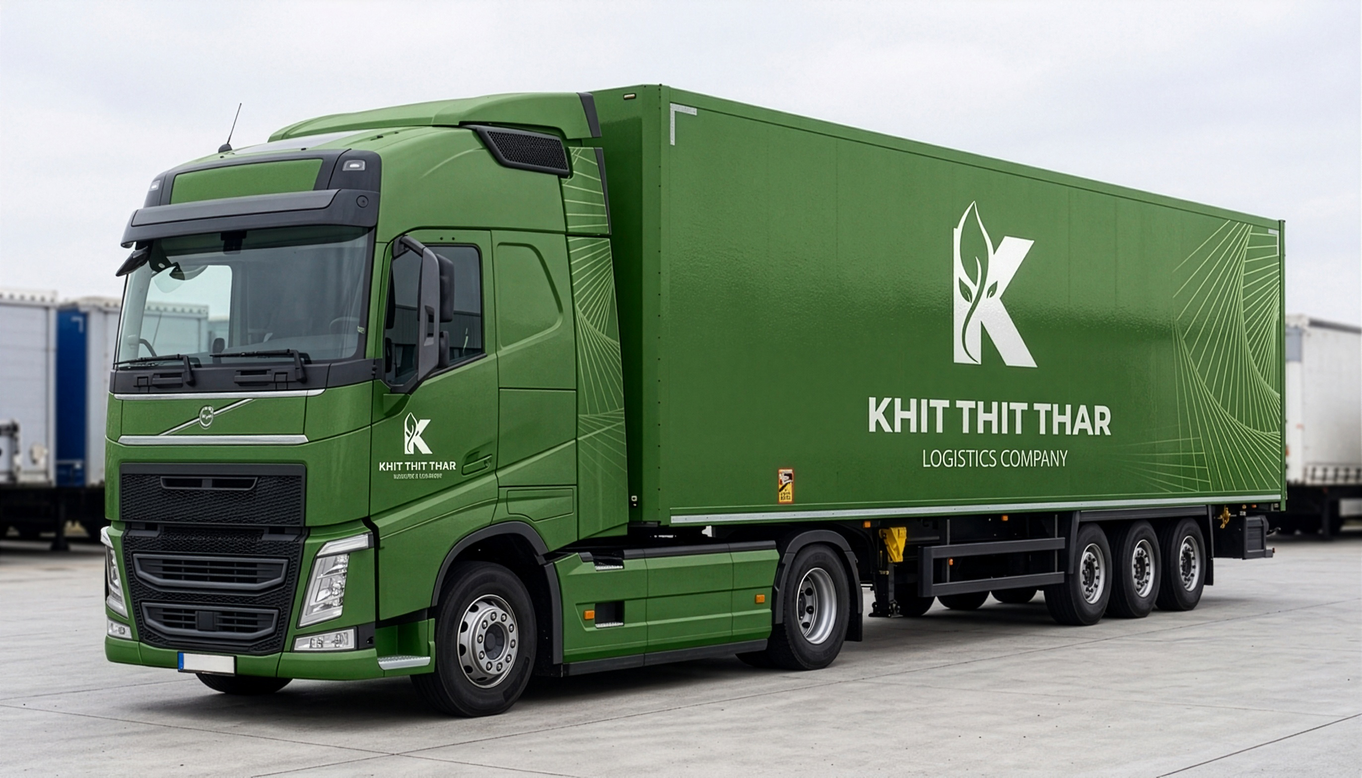
The logo features a bold, white sans-serif lettermark set against a deep moss-green field. The letter “K” is stylized with a negative-space vine and leaf detail climbing its vertical stem, symbolizing vitality and a “fresh start.” Below the icon, the company name is set in a heavy, high-contrast typeface for maximum readability, supported by a clean “Logistics Company” descriptor. The composition is framed by an intricate, swirling geometric pattern of light green lines, which creates a sense of depth, motion, and the complex networks inherent in the logistics world.