/ Project Overview
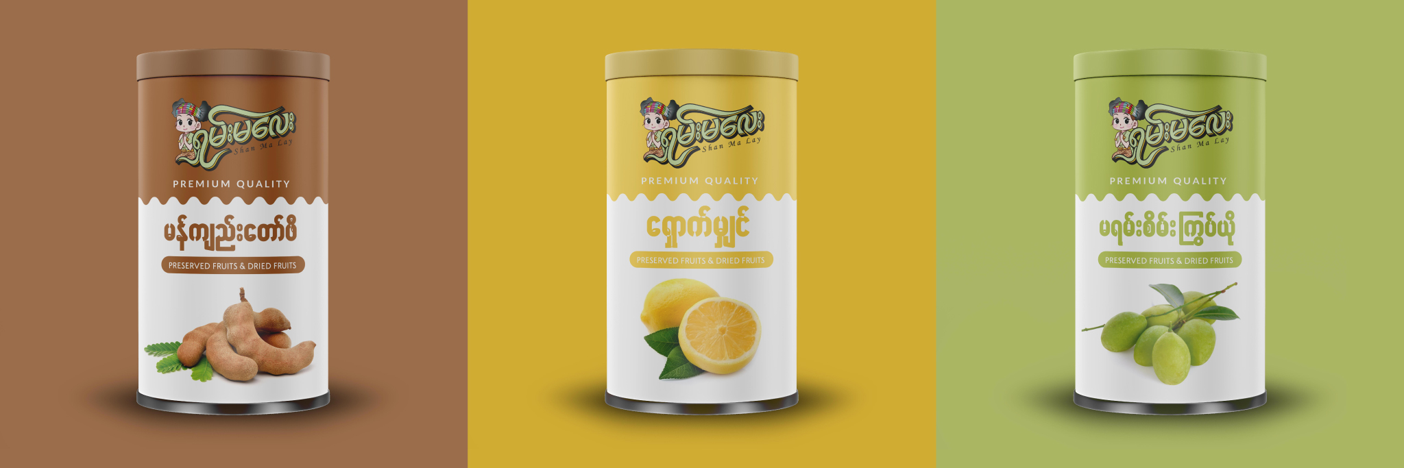
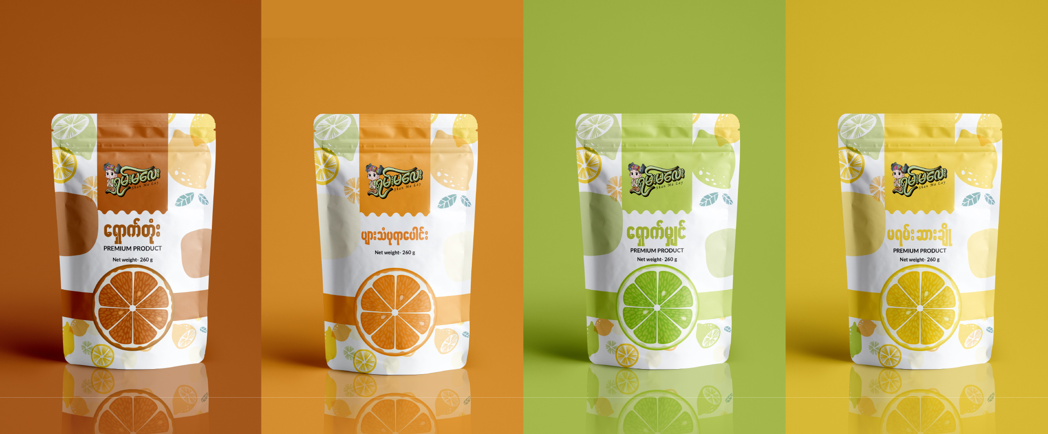
The logo features a charming mascot in traditional Shan dress, offering a welcoming “wai” gesture that symbolizes hospitality and respect. The custom “Shan Ma Lay” typography uses a bold, 3D-layered script that gives the brand a dynamic, energetic presence on the shelf. Paired with a soft, natural color palette of sage and golden yellow, the design reflects the organic nature of dried fruits, while the “Premium Quality” tagline adds a clean, professional finish to the overall composition.
/ Challenges
A key challenge was ensuring the mascot’s intricate cultural details—like the patterned headpiece and traditional attire—remained legible and impactful when scaled down for smaller fruit pouch packaging. Additionally, the team had to find a balance between the playful, character-driven illustration and the “premium” market positioning. It was vital that the brand felt approachable and friendly without losing the high-end, executive-level polish required for a boutique food product.
/ Objectives
The primary objective was to create a “fresh-meets-traditional” brand identity that stands out in the crowded snack market. By utilizing Bold Minimalism in the layout and vibrant, appetizing colors, the design aims to communicate the intense flavor and high quality of the dried fruits. The project sought to build a bridge between local tradition and a global audience, making the brand feel like a premium gift or a special treat rather than just a standard snack.