/ Project Overview
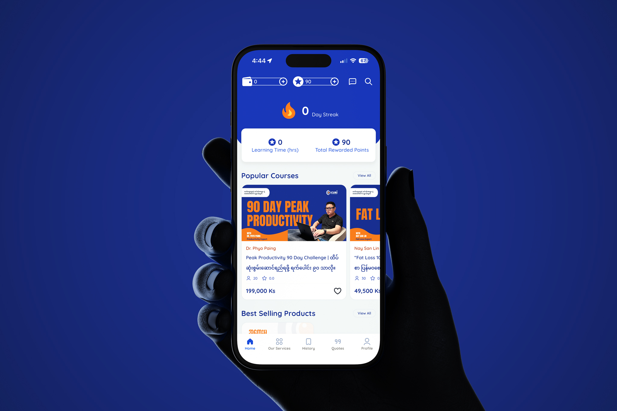
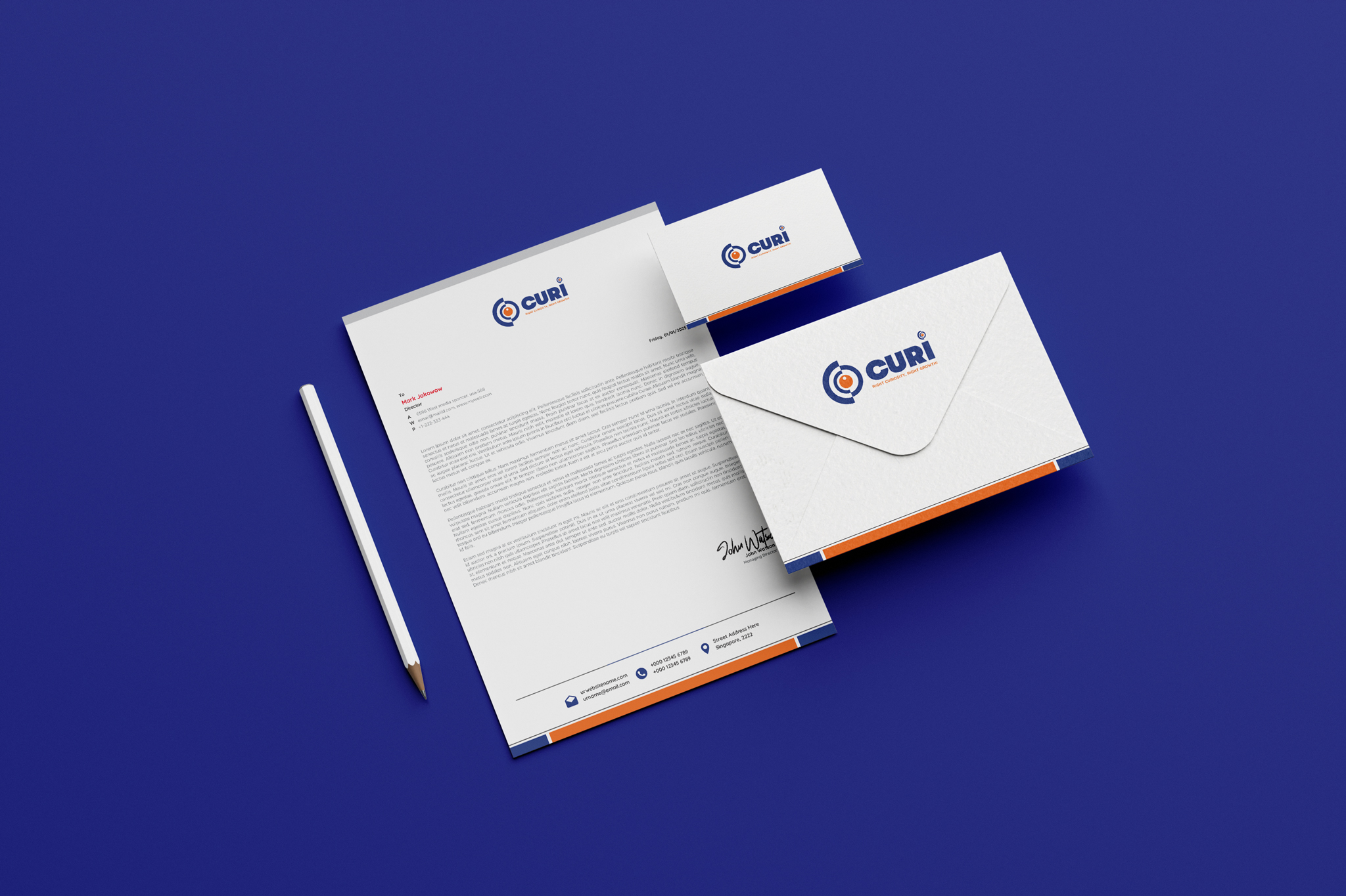
This project focused on developing a brand identity for a growth-oriented organization that values insight and perspective. The name “CURI” serves as a shortened, punchy derivative of “Curiosity,” setting the stage for a brand that encourages exploration and discovery. The goal was to create a visual system that feels authoritative yet energetic, utilizing a high-contrast color palette of navy and orange to signify trust and innovation. The result is a versatile mark designed to work effectively across both digital platforms and physical collateral.
/ Challenges
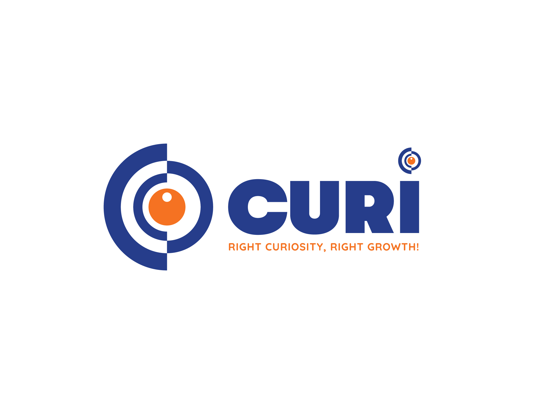
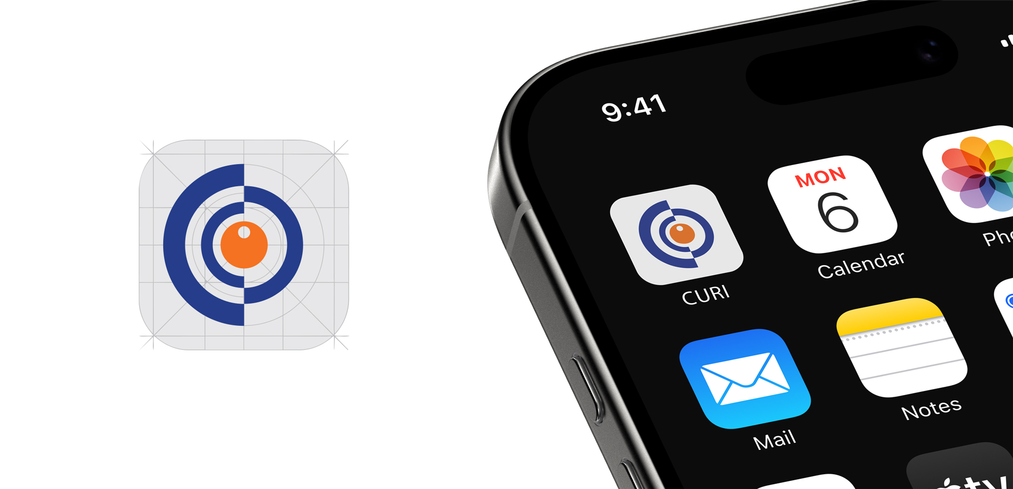
One of the primary hurdles was creating a symbol that represented “vision” and “curiosity” without falling into the cliché of a standard human eye. The design team had to find a way to abstract the eye into a series of geometric forms that suggested movement and layers of understanding. Additionally, balancing the weight of the thick, heavy lettering with the intricate lines of the logo mark required careful spatial adjustment to ensure that neither element overwhelmed the other, especially when scaled down for smaller applications like social media icons or business cards.
/ Objectives
The main objective was to communicate the brand’s core philosophy: that the “right curiosity” leads to the “right growth.” The visual identity needed to emphasize precision and focus, positioning the company as a guide that helps clients look deeper to find meaningful results. By using a “bullseye” aesthetic within the eye motif, the design intentionally points toward accuracy and goal-oriented progress. The aim was to build a brand presence that feels established and “expert-level,” while maintaining a fresh, studio-inspired vibe that appeals to forward-thinking audiences.